.png?width=200&height=89&name=CC%20logo%20blue-1%20(1).png)
Favicons are the small icons that represent your site in browser tabs, on phone home screens, and inside PWA launchers. A complete set covers browsers, iOS, and Android and requires six separate files.
🔔Note: Please send all files to support@contentcatalyst.com
Why Six Files ?
Different devices and contexts ask for different sizes and formats. A browser tab needs a tiny, sharp.ico. An iPhone home screen wants a specific PNG at exactly 180px. Android's adaptive icon system needs a version with extra padding built in. One file can't serve all of these.
Each file should be prepared individually at its intended size. Auto-generation often produces blurry results at small sizes and rarely handles the maskable safe zone correctly. Content Catalyst provides default CC icons for all six slots, which are replaced when you upload your own.
Here's what each file is for and where it gets used.
Favicon 32 × 32 px .ico
![]()
The legacy browser favicon. Appears in tabs, bookmarks, and browser history. Even modern browsers still request this file by default — it's often the first icon a browser looks for. An .ico is a container format and must be exported correctly, not just renamed from a .png. Mainly included for legacy compatibility.
Browser tab, Bookmarks, Browser history
Favicon 32 × 32 px .png
![]()
A PNG alternative to the .ico file. Modern browsers prefer this when it's present, as it renders more crisply on high-density displays. At 32px, your logo should be reduced to its simplest mark - wordmarks and fine detail will not read at this size.
Modern browsers, Browser tab, Bookmarks, Browser history
Apple 180 × 180 px .png
Used when someone saves your site to their iPhone or iPad home screen. Safari references this automatically. Apple applies its own rounded corners — your artwork should fill the entire 180px square with no pre-rounded corners or padding of your own. Like the maskable icon there is a safe area to consider. See below for full details
iOS home screen, iPadOS home screen
Android 192 × 192 px .png
The standard Android home screen icon for PWAs, referenced in the web app manifest. Shown when a user adds your site to their Android home screen. This is the version Android uses at normal icon sizes, so it needs to look sharp and recognisable at typical home screen dimensions.
PWA manifest, Android home screen
Android 512 × 512 px .png
Used for the PWA splash screen on Android — the loading screen shown when someone launches your installed site as an app. It's displayed large and centred, so this version should be your cleanest, highest-quality render. No special padding is required.
PWA manifest, Android splash screen
Android 512 × 512 px .png
A special version for Android's adaptive icon system. Unlike the other icons, this one must have a solid background and extra padding - Android crops the edges into whatever shape the device uses (circle, squircle, rounded rectangle, etc.). Your logo must sit entirely within the central safe zone. See below for full details.
PWA manifest, Android adaptive icons
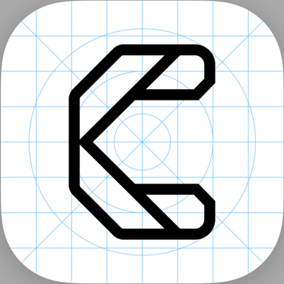
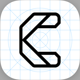
🔔 Note: Content Catalyst ships with the CC logo as placeholder icons for all six slots. Upload your own files to replace them.
When designing your favicons, we recommend using a solid background colour rather than a transparent one. Browser tabs, bookmark bars, and history panels can be any colour depending on the user's browser theme or OS settings - a transparent icon will render directly on whatever the browser applies, which may clash with or obscure your logo. A solid background keeps your icon looking intentional in every context. The background doesn't need to be white - it can match your brand colour - but it should be a deliberate choice rather than relying on the browser to provide one.
Understanding maskable icons
This is the one concept that trips most people up. Android doesn't display your icon as-is - it crops it into a shape chosen by the device manufacturer. The same icon might be a circle on a Pixel, a squircle on a Samsung, or a rounded rectangle on another device.
What masking looks like
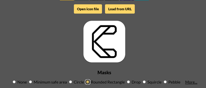
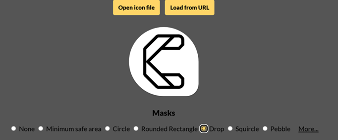
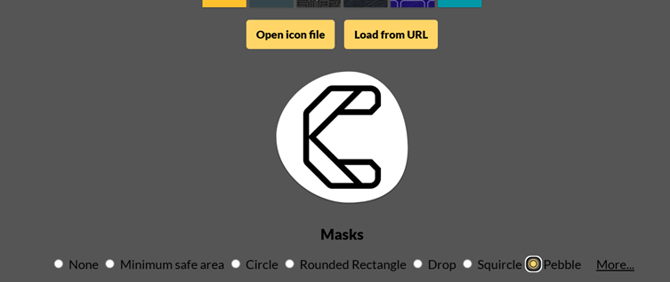
The CC default maskable icon, previewed in three of the most common crop shapes at maskable.app:
The safe zone
The maskable icon is 512 × 512 px, but Android will crop it aggressively. Your logo must sit entirely within a circle at the centre - roughly 80% of the canvas, or about 409 px in diameter. You can build or get a layout template to help you with positioning.
That means leaving roughly 18% padding on each side. If your logo touches the edges of the canvas, it will be cut off on some devices.
The icon should also have a solid background colour - no transparency. Android fills any transparent areas with the device's default colour, which may clash with your logo.
Use maskable.app to preview how your icon will look in different crop shapes before uploading.
🔔 Note: Using the same 512px PNG for both the regular icon and the maskable icon. The maskable version needs explicit safe-zone padding and a solid background — they must be different, separately designed files.
There is a known issue with chrome on android over-cropping maskable icons compared to the W3 specification. If you want to take this known issue into account, the safe zone should be considered as 60% of the canvas instead of 80%.
Understanding Apple icons
The Apple touch icon works similarly to the maskable icon - iOS crops it into a shape rather than displaying your square artwork as-is. But the mechanics are different enough to be worth understanding separately.
iOS applies a superellipse (Apple's version of a squircle) to your icon automatically. You submit a plain square — no pre-rounded corners, no shadows. iOS handles masking entirely.
The corner radius consumed is roughly 10% of the icon width — about 18px on a 180px canvas. This means the four corners of your artwork will be clipped. Keep any important elements away from the very edges, but you don't need to leave large margins: unlike the maskable icon, iOS clips a relatively small amount and the safe area is a rounded rectangle, not a circle.
Apple's own guidance suggests keeping critical content within the central ~80% of the canvas (roughly a 144 × 144 px area on a 180px icon), while allowing fills and background colours to extend to the full edge.
🔔 Note: If you pre-round the corners of your Apple touch icon artwork, iOS will apply its superellipse mask on top — creating an awkward double-radius effect. Submit a perfect square and let iOS do the masking.
Key differences between the Apple icon and the maskable icon
|
Apple touch icon |
Maskable icon |
|
|
Canvas size |
180 × 180 px |
512 × 512 px |
|
Mask shape |
Fixed superellipse (Apple's squircle) — consistent across all iOS devices |
Varies by Android device — circle, squircle, drop, pebble, and more |
|
Safe zone shape |
Rounded rectangle — corners only |
Circle — all four sides cropped significantly |
|
How much is cropped |
~10% at corners only (≈18px on a 180px canvas) |
~18% on all sides (safe zone is ~80% diameter circle) |
|
Background |
Solid or transparent — iOS won't fill transparent areas |
Must be solid — Android fills transparent areas unpredictably |
|
Corner radius |
Never add your own — iOS applies it automatically |
Not applicable — Android masks the whole shape |
Preparing your files
Each icon should be designed at its intended size, not auto-scaled from a single source. Small sizes in particular need care - a logo that looks great at 512px often needs to be redrawn or simplified to read clearly at 32px.
- Start from a high-resolution source
- Design each size separately
- Create the .ico file from your 32px PNG
- Design the maskable icon with safe-zone padding
- Check the maskable icon at maskable.app
Work from an SVG or a PNG at 1024px or larger. Scaling down is always preferable to scaling up. Make sure your source has clean vector paths rather than rasterised artwork where possible.
At 32px, fine detail is lost and letterforms become unreadable. Design a simplified version - usually just the core icon mark, not the full wordmark. At 180px, 192px and 512px you have more room, but each size should still be reviewed and adjusted at 100% zoom.
An .ico is a container format - don't just rename a .png to .ico. Use a conversion tool such as favicon.io to correctly convert your 32px PNG to the .ico format.
In your design tool, set up a 512px canvas with a solid background colour. Place your logo so it sits within the central circle — roughly 60–70% of the canvas width. Add a safe-zone guide at 409px diameter to keep you within bounds. This file must be different from your standard 512px icon.
Before uploading, test your maskable icon at maskable.app. Toggle through the different mask shapes (circle, squircle, drop, pebble) to confirm the logo is fully visible and well-proportioned in each.