.png?width=200&height=89&name=CC%20logo%20blue-1%20(1).png)
Header & Navigation bar links can highlight marketing sites, internal content & categories, or external URLs.
🔔Note: The Showcase page must be enabled before the Header section can be accessed. Please contact support@contentcatalyst.com for more information.
Adding Links via the Header Section
To access the Header section, Site Administrators should navigate to Admin > Site administration > Header.

Links can be added and removed from the showcase page's Header or Navigation bar sections.
There's no limit to the number of links that can be added.
To add a new link to each section, use the + add option.
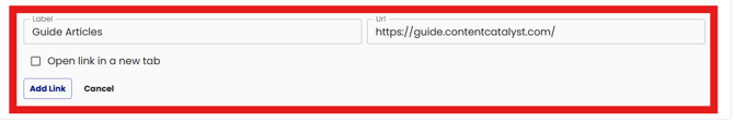
Add a Label and the corresponding URL, then select 'Add Link'.
Header links can be configured to open in a 'New Tab' by selecting the 'Open link in a new tab' toggle.
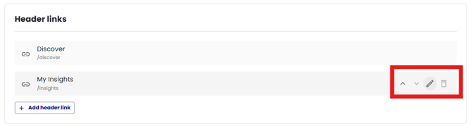
To amend an existing link, use the edit icon shown below:
Administrators can choose to save as a draft or publish the links once they have applied any changes.

The current version of the changes will be displayed at the top of the page.

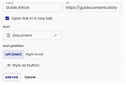
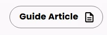
Stylised links: Icons and Buttons
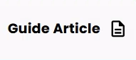
Links can be stylised with icons and a button.
Icons:
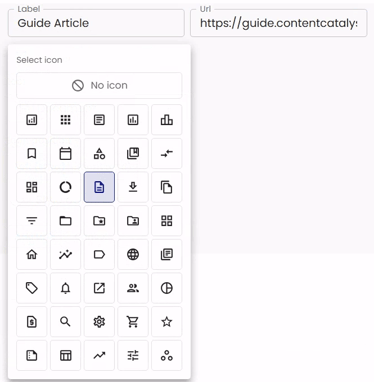
Choose an icon from the 'select icon' menu shown below.
The list contains a subset of the default MUI icons.
The icon position can be set either at the start or end of the Label text.
Left (start) Right (end)

Style as Button:
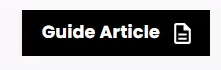
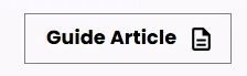
Select the 'Style as button' option to display the link as a button.
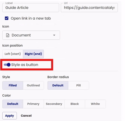
The following style options are available
Filled: Fills the button area with colour.
Outlined: Outlines the button area with colour.
Border radius : Changes the border radius of the button.
Default: Matches the configured border radius of the Showcase section cards on your site.
Pill : Shows fully rounded edges; this matches the search bar styling. See below.
Colour: Choose the colour, these colours are based off of your sites colours.
- Default
- Primary
- Secondary
- Black
- White
Remeber to Apply any changes to save these settings.
🔔Note: Please contact support if the 'Style as button' option is not available for your site.
Header Section
Please take a look at the different sections below and how they appear.
The Header section is highlighted below:
This section appears at the top of the page.
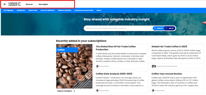

🔔Note: By default, the Header section appears with a white background and black text. This can be customised, and branding can be matched similar to the primary and secondary colours configuration.
Navigation Bar Section
The Navigation Bar section is highlighted below:
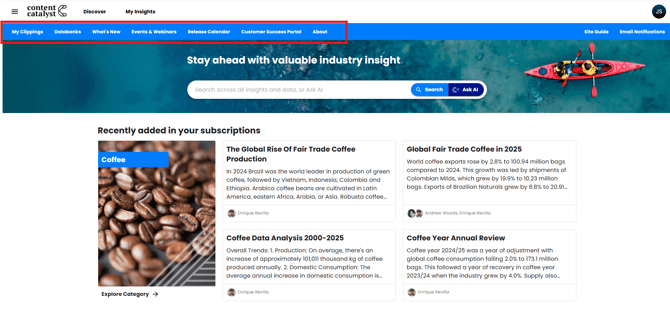
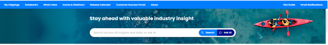
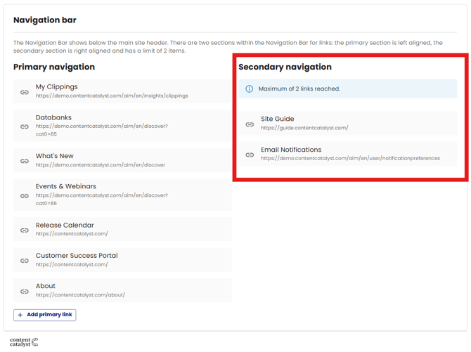
The Navigation Bar is shown below the main site header.
The navigation bar has two sections for links: the primary section is left-aligned, and the secondary section is right-aligned and has a limit of 2 items.
If 2 links are used in the right-aligned secondary section, a warning will appear stating that the Maximum of 2 links has been reached.
See below.
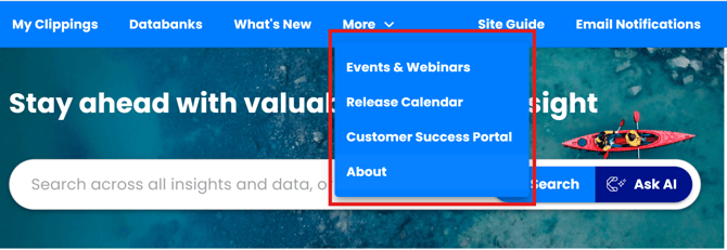
'More' Dropdown Menu
The headers are responsive, so the "more" overflow menu will show depending on how wide the screen is or if a larger number of links are added, is shown below:

See the links appear in the 'More' dropdown menu.
Links in Mobile View
In mobile view, the header links are moved into the side bar menu as shown below.
Initially, in mobile view, the links may appear to be missing.

Using the sidebar will reveal the 'More' dropdown menu.

🔔See also: Showcase: Getting Started