.png?width=200&height=89&name=CC%20logo%20blue-1%20(1).png)

The Hero Section can be configured to display your branding and the text of your choice. It features a search bar to launch user queries and an optional link to direct users to chat with AI Chat. The Hero section is customisable and plays a key role in establishing your platform’s identity and guiding users to relevant content quickly.
🔔Note: Only one Hero section image can be applied globally.
How The Hero Section Works:
The Hero Section appears as a full-width banner at the top of the Showcase Page and includes:
-
A search bar that allows users to search for content directly
-
Optional AI Chat integration for AI-powered search
-
Branding elements such as logo, background image, and welcome message
-
An optional Call-to-Action (CTA) for guiding users to featured areas
If AI Chat is enabled on your site, a toggle will appear in the search bar, allowing users to switch between traditional search and AI chat mode.
Configuring the Hero Section:
Hero section Customisation Options
Text elements:
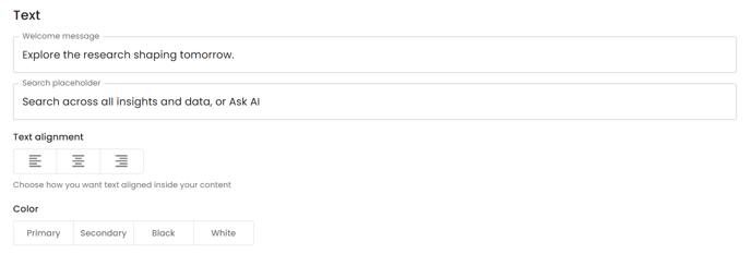
Welcome message: The welcome message appears at the top of the page, above the search bar. Use it to greet users, introduce your content, reinforce your brand's tone and personality, and more.
Search Placeholder Text: This is the prompt text that appears inside the search bar before the user types. Add a prompt for subscribers in the search bar here, for example, ‘ What content are you looking for today?’, or 'Search by keyword, topic, or author...'
Text Alignment: Set the Alignment of the welcome message text to ‘Left’, ‘Centre’, or ‘Right’.
Text Colour: Set the colour of the Welcome message text to either the site's ‘Primary’, ‘Secondary’, ‘Black’ or ‘White’.
Hero Section Background Image:
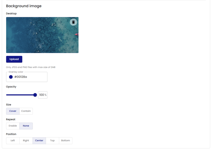
Background Image: Upload a background image to be displayed.
Only JPEG and PNG files are accepted here, with a maximum file size of 2MB.
Width 1920px * Height:(min260px)
Overlay Color: Set the background colour to your Hero section image. Add a hex number to assign the selected colour. This colour will be displayed behind the background image.
Opacity: Choose the background image's opacity. A lower Opacity setting will show more of the Overlay colouration, while a higher setting will show more of the Image.
- Lower Opacity setting
- Higher Opacity setting
Size: The background image can be set to 'cover' or 'contain'.
- Selecting Cover will present a zoomed-in section of the background image to fill the entire hero section. See below:
- Selecting Contain will present the image in its entirety with the overlay colour present in the background of the image. See below:
Repeat: Set to ‘Enable’ to repeat the image.
Position: Set the Image position.
The Hero Section is your subscribers’ first interaction with the Showcase page. With its built-in search, flexible branding, and optional AI integration, this section sets the tone for user experience and discovery. Use it to reinforce your platform’s identity, highlight value, and guide users toward meaningful engagement from the very first click.
🔔See also: To further personalise your Showcase Page, consider using the Adverts Section to promote key events, services, or reports alongside your Hero section.