.png?width=200&height=89&name=CC%20logo%20blue-1%20(1).png)
 The advertisement section is a flexible promotional space on the Showcase Page that allows you to display banners, messaging, and calls to action. Use it to promote events, services, research agendas, or other valuable offerings. Each advert is fully customisable and can include branded messaging, links, and responsive background images.
🔔Note: You can add as many advertisement Sections to the Showcase Page as you like, in any order See: Getting Started.
How It Works
The advertisement Section displays one or more promotional blocks on the Showcase Page, each designed to highlight a product, service, event, or key message. Each advert appears as a card or banner featuring an image, title, and a clickable call-to-action (CTA) link.
Admins can add multiple advert blocks, rearrange them, and update them at any time—all without coding. This section is static and always visible to users, regardless of their license level, making it ideal for promoting high-impact or time-sensitive content across your entire subscriber base.
Configuration Options:
Advert: Text
Headline & Subheadline
-
Set a bold headline and optional subheadline.
Text Alignment
-
Align text within the advert block to Left, Centre, or Right, depending on your design preference.
Text Block Position
-
You can position the content within the advert block as you choose, whether to the right, centre, left, or across the whole section.
Text Colour
-
Choose from your site's primary, secondary, or custom brand colours.

Advertisement CTA Button:

Button:
CTA: In the CTA box, enter the phrase you would like to use as your call to action. This will provide the text that will display on the button.
URL: Enter the URL you would like your Advert Section button to redirect to.
Color: Select between Primary, Secondary, Black, and White to determine the colour.
Open link in a new tab: Select the 'open link in a new tab' box to direct the URL you provide to a new tab.
Advertisement Background Image:
Upload a landscape ratio image for desktop, or a portrait image for mobile.
The mobile image will automatically display on smaller screens under 600px wide. If no image is uploaded for mobile, the desktop image will be displayed for all screen sizes.
🔔Note: Please ensure your images follow these guidelines for the best display results. You can upload JPEG and PNG files with a maximum size of 2MB.
Recommended image size for Advertisement W:1920px * H:(min 400)
Advertisement Overlay Colour:
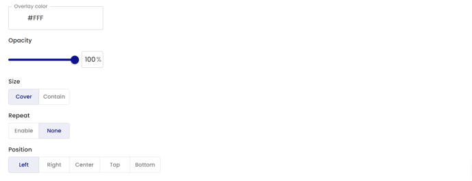
Set the advert background colour using the 'overlay colour'.
Add a hex number to assign the selected colour. This colour will be displayed behind the background image.
Opacity: Choose the Opacity of the background image. A lower Opacity setting will display more of the Overlay colouration, while a higher setting will display more of the Image.
Lower Opacity will display less of the image and more of the background colour as shown below:

High Opacity will display more of the image and less of the background colour as shown below:

Size: Contain / Cover; Selecting Cover will present a zoomed-in section of the background image to fill the entire hero section. See below:
Size set to ‘Cover’.
Repeat: Set to ‘Enable’ to repeat the image. See below:
Position: Set the Image position.
The Advertisement Section offers a simple way to share announcements, promote products, or highlight events directly on the Showcase Page. It’s easy to set up and ensures important information is visible to all users, regardless of their license. Admins can update or rearrange advertisements at any time to reflect current priorities.
🔔Note: Use the Account Manager Section to connect users with their dedicated support contact for direct subscriber engagement.