- Guide & Help
- Setting Up Your Content Catalyst Subscriber Portal
- Site Design & Branding
-
Setting Up Your Content Catalyst Subscriber Portal
-
Site Authentication & User Registration
-
Account & User Management
-
Licensing & Access Management
-
Organise, Categorise, and Link Content
-
Create & Deliver Content and Data
-
Operations & Administration support
-
Site Extensions & Integrations
-
Tracking & Analytics of Subscriber Use
-
Sales & Marketing
-
Content Discovery
-
End-User Actions
Colour Scheme and Fonts
Information covering site colour customisation areas, where brand colours can be displayed, and in-report customisation options
Read this article to understand how to:
- Strengthen brand identity
- Take ownership of your subscriber portal's look and feel!
We apply custom colours and fonts, as well as add your logo to reflect your company's brand during the launch process. There are also lots of other ways to customise your site's look and feel from the admin area.
To help us build the designs, we need:
- One primary colour
- One secondary colour
- Logo
- Header/Call to action font
- Text font
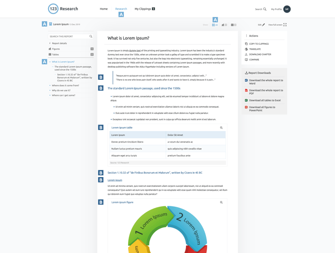
🔔 The following images display where exactly the Main Colour (A) and Secondary Colour (B) will be applied. This will help you decide which colour you would like to use for each.
Homepage
Search Page
Report Marketing Page
Report landing Page
Active Tab and Clipping Count
Report Content
There are four different themes to choose from when styling your report content. Each is a different combination of your primary/secondary colours and the basic site black/greys.
🔔 Once you select a theme, all interactive content on your site will inherit these text colours!
Theme 1

Theme 2
Theme 3
Theme 4

Find more articles and guidance covering Site Design & Branding options here.
.png?height=120&name=Group%20(2).png)

.png?width=688&height=347&name=search%20page%20(5).png)


